Requirements:
- flex
- 가운데 정렬을 비롯한 대부분의 정렬은 flex를 통해 구현할 수 있습니다.
- 특히 여러 컨텐츠를 가로 혹은 세로 방향으로 일정 간격으로 배치하고 싶다면 더욱 적합할 것입니다.
- flex는 방향(direction)에 따라 메인 축(main-axis)과 교차 축(cross-axis)이 의미하는 바가 다릅니다.
- 구현하고자 하는 컨텐츠의 방향이 가로인지, 세로인지 잘 판단해서 작성하시기 바랍니다.
- flex-direction에 대해 알아보세요.
- class
- 하나의 요소에 한 개 이상의 class를 설정할 수 있습니다.
- 하나의 class가 하나의 스타일을 갖는다면, 두 개의 class를 가진 요소는 두 가지의 스타일이 모두 적용됩니다.
- border
- 테두리를 의미하는 border 속성에는 여러 하위 속성이 존재합니다.
- 하위 속성들을 이용해 border의 색상, 스타일, 두께 등을 따로 설정할 수 있습니다.
<!DOCTYPE html>
<html>
<head>
<meta charset="utf-8">
<meta name="viewport" content="width=device-width">
<title>repl.it</title>
<link href="style.css" rel="stylesheet" type="text/css" />
</head>
<body>
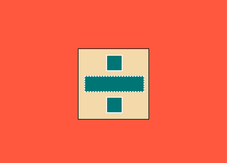
<div id="middle-box">
<div class="little-box"></div>
<div class="little-box"></div>
<div class="little-box"></div>
</div>
<script src="script.js"></script>
</body>
</html>
body, html{
	background-color : tomato;
	display: flex;
	justify-content: center;
	align-items: center;
	height : 100%;
}

#middle-box{
	background-color :#F5DEB3;
	width: 250px;
	height: 250px;
	border: 2px solid black;
	display: flex;
	justify-content: space-evenly;
	align-items: center;
	flex-direction: column;
}

.little-box{
	background-color: #008080;
}

.little-box:nth-child(odd){
	width: 50px;
	height: 50px;
	border: 3px solid white;
}

.little-box:nth-child(even){
	width: 150px;
	height: 50px;
	border: dashed white;
}'웹 개발 > HTML,CSS' 카테고리의 다른 글
| 노마드코더 : 코코아톡 챌린지8일 transform, @keyframes 사용 (2) | 2021.09.15 |
|---|---|
| 노마드코더 : 코코아톡 챌린지7일 Pseudo Selector(의사 선택자) 사용하기 (0) | 2021.09.13 |
| 노마드코더 : 코코아톡 챌린지4일 form과 input 태그 (0) | 2021.09.09 |
노마드코더 : 코코아톡 챌린지6일 flex box 이용하기