
💡 문제
→ ApexCharts는 차트라이브러리이다.
→ 원하는 디자인대로 커스텀하기 생각보다 어렵다.
🗡 해결
→ 하지만 못할 것은 없다, 나에겐 무적 CSS가 있다.
→ 원하는 위치, 원하는 내용을 넣엔 CSS position: relative; position: absolute;가 있다.
→ 차트의 기본 기능만 사용하고 나머지는 CSS를 이용해서 열심히 커스텀해보자!
ApexCharts 공식 홈페이지
ApexCharts.js - Open Source JavaScript Charts for your website
ApexCharts.js - Open Source JavaScript Charts for your website
ApexCharts is a a free and open-source modern charting library that helps developers to create beautiful and interactive visualizations for web pages.
apexcharts.com
bar차트에 대한 기본 옵션 공식 문서
Pie / Donut Chart Guide & Documentation - ApexCharts.js
Pie / Donut Chart Guide & Documentation – ApexCharts.js
Read the documentation on how to create interactive JavaScript Pie Charts / Donut Charts with examples built using ApexCharts.
apexcharts.com
수많은 codepen 예제 모음
CodePen Search
codepen.io
목표는 디자이너님에게 최대한 맞드는 것이다.
하지만 일반 기능으로는 원하는 디자인으로 만들기 불가능한것 같다.
이것이 디자이너 님께서 만들어준 마이페이지 삼대력 차트이다.
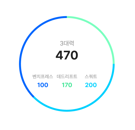
글을 내부에 넣고싶은데, 한줄에 각각 다른 데이터를 넣을 수 없었다.
진짜 차트 예제 다 봤는데 방법이 없다.
→ position: relative; position: absolute;를 이용해서 표와 글자가 따로 가는 방법밖에 생각할 수 없었다.
완성… 이정도면…성공적이지 않을까…?
import styled from "styled-components";
import ApexCharts from "react-apexcharts";
function setChartOption() {
const ChartOptions = {
options: {
chart: {
type: "donut",
},
legend: {
show: false,
},
responsive: [
{
breakpoint: 480,
},
],
dataLabels: {
enabled: false,
},
plotOptions: {
pie: {
donut: {
size: "95%",
},
},
},
labels: ["데드리프트", "벤치프레스", "스쿼트"],
fill: {
opacity: 1,
colors: ["#0066FF", "#7AFFBF", "#00D1FF"],
},
tooltip: {
enabled: true,
y: {
formatter: function (val) {
return val !== 1 ? val + "kg" : val - 1 + "kg";
},
title: {
formatter: function (seriesName) {
return "";
},
},
},
},
stroke: {
show: false, //차트 border
},
},
};
return ChartOptions.options;
}
export default function UserPowerChart({ PowerData }) {
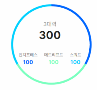
//삼대력 정보가 없는 경우 1로 처리해서 동등한 비율로 그래프 보여주기
if (PowerData[3] === 0) {
PowerData[0] = 1;
PowerData[1] = 1;
PowerData[2] = 1;
}
return (
<ChartsBox>
<ApexCharts
options={setChartOption()}
series={PowerData.slice(0, 3)}
type="donut"
width="300"
height="300"
/>
<InnerInfo>
<InnerTop>
<InfoSumTitle>3대력</InfoSumTitle>
<InfoSumValue>{PowerData[3]}</InfoSumValue>
</InnerTop>
<InnderBottom>
<div>
<InfoPowerTitle>벤치프레스</InfoPowerTitle>
<InfoPowerValue style={{ color: "#0066ff" }}>
{PowerData[0] !== 1 ? PowerData[0] : PowerData[0] - 1}
</InfoPowerValue>
</div>
<div>
<InfoPowerTitle>데드리프트</InfoPowerTitle>
<InfoPowerValue style={{ color: "#7affbf" }}>
{PowerData[1] !== 1 ? PowerData[1] : PowerData[1] - 1}
</InfoPowerValue>
</div>
<div>
<InfoPowerTitle>스쿼트</InfoPowerTitle>
<InfoPowerValue style={{ color: "#00d1ff" }}>
{PowerData[2] !== 1 ? PowerData[2] : PowerData[2] - 1}
</InfoPowerValue>
</div>
</InnderBottom>
</InnerInfo>
</ChartsBox>
);
}
const ChartsBox = styled.div`
position: relative;
`;
const InnerInfo = styled.div`
position: absolute;
top: 60px;
left: 46px;
width: 200px;
display: flex;
flex-direction: column;
align-items: center;
`;
const InnerTop = styled.div`
margin-bottom: 30px;
`;
const InfoSumTitle = styled.p`
font-family: "Pretendard";
font-style: normal;
font-weight: 400;
font-size: 18px;
line-height: 26px;
text-align: center;
color: #888888;
`;
const InfoSumValue = styled.p`
font-weight: 700;
font-size: 36px;
line-height: 44px;
text-align: center;
color: ${(props) => props.theme.reverseFontColor};
`;
const InnderBottom = styled.div`
width: 100%;
display: flex;
justify-content: space-between;
align-items: center;
z-index: 10;
`;
const InfoPowerTitle = styled.span`
font-family: "Pretendard";
font-style: normal;
font-weight: 400;
font-size: 14px;
line-height: 22px;
text-align: center;
color: #888888;
`;
const InfoPowerValue = styled.div`
font-family: "Pretendard";
font-style: normal;
font-weight: 700;
font-size: 18px;
line-height: 26px;
text-align: center;
`;'웹 개발 > React 프로젝트' 카테고리의 다른 글
| [React] ApexCharts 커스텀(Bar) (1) | 2022.09.10 |
|---|---|
| [React] useCallback을 사용해서 한번만 api 요청하게 하자 (1) | 2022.09.10 |
| [React] 로그인, 로그아웃 에러핸들링 고민 (0) | 2022.09.10 |
| [React] 비동기 데이터 axios Post 전송(Query String, Request body) (1) | 2022.09.10 |
| [React] Warning Received true for non-boolean attribute 오류 해결 (0) | 2022.07.25 |