
flex box 참고
https://armadillo-dev.github.io/css/what-is-flexbox/
[CSS] Flexbox 이해하기
필자는 웹 페이지의 레이아웃을 구성하기 위해 float와 position 등의 속성을 주로 이용했다. 그러나 Flexbox의 등장 이후 사용 빈도가 현저히 줄어들었다. 이 글에서는 Flexbox에 대해 설명하고, 예제를
armadillo-dev.github.io
https://heropy.blog/2018/11/24/css-flexible-box/
CSS Flex(Flexible Box) 완벽 가이드
많은 경우 float, inline-block, table 등의 도움을 받아서 수평 레이아웃을 구성하지만 이는 차선책이며, 우리는 Flex(Flexible Box)라는 명확한 개념(속성들)으로 레이아웃을 쉽게 구성할 수 있습니다. CSS F
heropy.blog
grid 참고
https://armadillo-dev.github.io/css/understanding-grid-layout/
[CSS] Grid layout 이해하기
Grid layout은 Flexbox와 마찬가지로, 레이아웃을 보다 수월하게 구성할 수 있도록 도와준다. 특히 열과 행으로 구성된 레이아웃에 탁월함을 보인다. 이 글에서는 Grid layout에 대해 설명하고, 예제를
armadillo-dev.github.io
https://heropy.blog/2019/08/17/css-grid/
CSS Grid 완벽 가이드
CSS Grid(그리드)는 2차원(행과 열)의 레이아웃 시스템을 제공합니다.Flexible Box도 훌륭하지만 비교적 단순한 1차원 레이아웃을 위하며, 좀 더 복잡한 레이아 ...
heropy.blog
container에 사용
display : grid
- grid는 기본이 box 속성
- 한줄씩 차지 한다.

display : inline-grid
- inline 속성으로도 변경 가능

grid-template-rows
그리드 행의 크기 조정 기능

/* Keyword value */
grid-template-rows: none;

/* <track-list> values */
grid-template-rows: 100px 1fr;
grid-template-rows: [linename] 100px;
grid-template-rows: [linename1] 100px [linename2 linename3];
grid-template-rows: minmax(100px, 1fr);
grid-template-rows: fit-content(40%);
grid-template-rows: repeat(3, 200px);
grid-template-rows: subgrid;
grid-template-rows: masonry;

/* <auto-track-list> values */
grid-template-rows: 200px repeat(auto-fill, 100px) 300px;
grid-template-rows: minmax(100px, max-content)
                       repeat(auto-fill, 200px) 20%;
grid-template-rows: [linename1] 100px [linename2]
                       repeat(auto-fit, [linename3 linename4] 300px)
                       100px;
grid-template-rows: [linename1 linename2] 100px
                       repeat(auto-fit, [linename1] 300px) [linename3];

/* Global values */
grid-template-rows: inherit;
grid-template-rows: initial;
grid-template-rows: revert;
grid-template-rows: unset;
grid-template-columns
그리드 열의 개수 생성 및 크키 조정
/* Keyword value */
grid-template-columns: none;

/* <track-list> values */
grid-template-columns: 100px 1fr;
grid-template-columns: [linename] 100px;
grid-template-columns: [linename1] 100px [linename2 linename3];
grid-template-columns: minmax(100px, 1fr);
grid-template-columns: fit-content(40%);
grid-template-columns: repeat(3, 200px);
grid-template-columns: subgrid;
grid-template-columns: masonry;

/* <auto-track-list> values */
grid-template-columns: 200px repeat(auto-fill, 100px) 300px;
grid-template-columns: minmax(100px, max-content)
                       repeat(auto-fill, 200px) 20%;
grid-template-columns: [linename1] 100px [linename2]
                       repeat(auto-fit, [linename3 linename4] 300px)
                       100px;
grid-template-columns: [linename1 linename2] 100px
                       repeat(auto-fit, [linename1] 300px) [linename3];

/* Global values */
grid-template-columns: inherit;
grid-template-columns: initial;
grid-template-columns: revert;
grid-template-columns: unset;
grid-template-columns + grid-template-rows
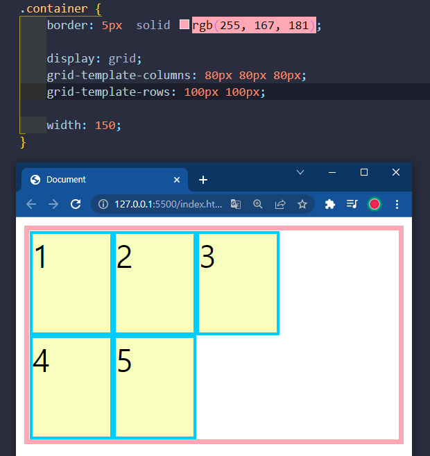
초과되어 지정하지 않은 너비, 높이는 해당 box의 고유의 높이로 설정

fr이란 비율을 설정

repeat(반복횟수, 사이즈) 통해서 반복 표기 가능

grid-template-areas
사각형의 영역을 만들고, 그 영역 내에서 땅따먹기 하듯이 격자에 이름을 지정해서 영역을 나눔
https://developer.mozilla.org/en-US/docs/Web/CSS/grid-template-areas
grid-template-areas - CSS: Cascading Style Sheets | MDN
The grid-template-areas CSS property specifies named grid areas, establishing the cells in the grid and assigning them names.
developer.mozilla.org
grid-area를 통해서 이름을 붙여주고,
grid-template-areas를 통해서 구역을 나눠줄 수 있다.


'웹 개발 > 기초' 카테고리의 다른 글
| 자바스크립트 기본 문법 (0) | 2022.03.14 |
|---|---|
| [css] 반응형 레이아웃 만들기 (0) | 2022.03.10 |
| [CSS] 자주 사용하는 속성 (0) | 2022.03.06 |
| [CSS] 단위(em, rem, vw, vh, vmax, vmin) (0) | 2022.03.04 |
| [CSS] 선택자 (0) | 2022.03.03 |